Hur lär man studenter hur utsläppsrätter fungerar?
Utsläppsrätter är något de flesta känner till som begrepp, men hur funkar det egentligen? På…
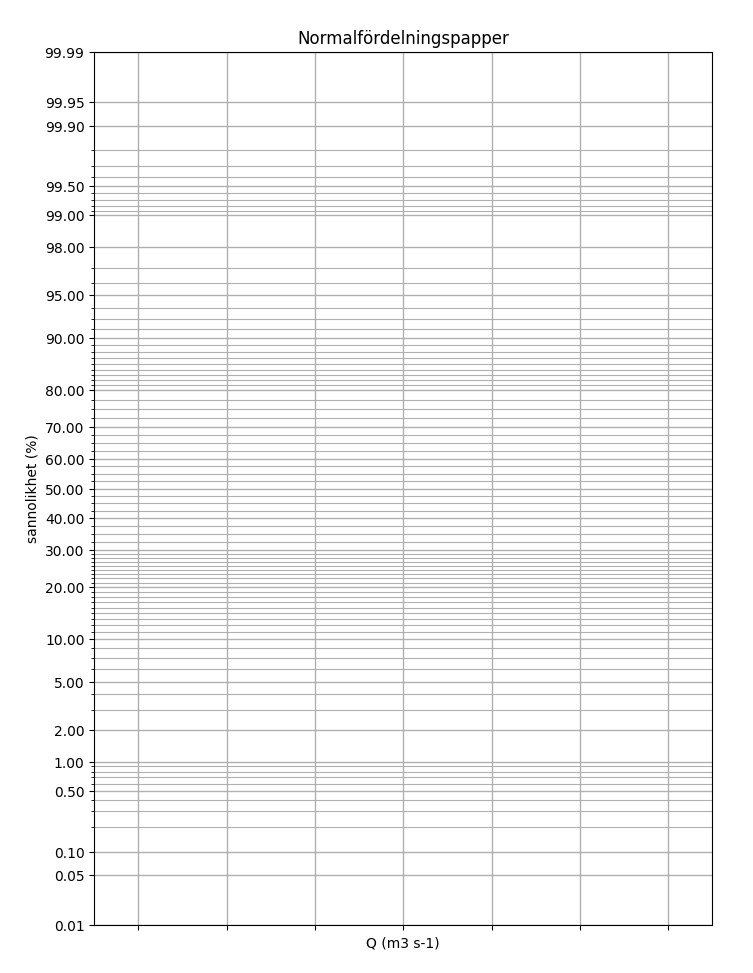
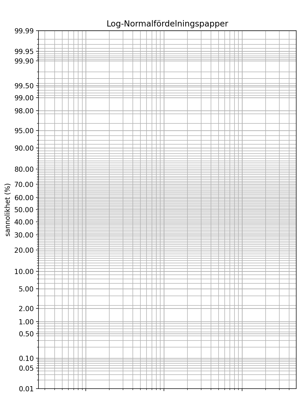
När man analyserar flöden i vattendrag och skall beräkna återkomsttider kan man använda sig av Gringortens ekvation:
T_r = \frac {(i+0.12)}{(m-0.44)}där n är totala antalet flödesvärden och m är ranknumret, och plotta Tr på ett normalfördelning eller log-normalfördelningpapper (om man misstänker log-normalfördelning i sina mätdata). På så vis kan man snabbt läsa av återkomsttider för olika flöden och vice versa.
Bra normalfördelningpapper eller log-normalfördelningpapper kan vara svåra att hitta (paradoxalt nog) så jag bestämde mig för att göra egna, genom Python och några bra bibliotek (numpy, matplotlib och scipy.stats). Resultatet kan du se nedan.
Detta går utmärkt att använda för till exempel ovanstående syfte. Pythonkoden för normalfördelningspapper kommer här:
import numpy as np
import matplotlib.pyplot as plt
import scipy.stats as stats

# Generate Z-scores
z_scores = np.linspace(-3.5, 3.5, 1000)
percentiles = stats.norm.cdf(z_scores) * 100

# Create the plot
fig, ax = plt.subplots(figsize=(10, 8))

# Plot Z-scores vs Percentiles
ax.plot(z_scores, percentiles, color='white', linewidth=0)

# Create a function for the inverse normal distribution
def inv_normal(p):
    return stats.norm.ppf(p / 100)

# Customize the y-axis to mimic the normal probability paper
yticks_percentiles = np.array([
    0.01, 0.05, 0.1, 0.5, 1, 2, 5, 10, 20, 30, 40, 50,
    60, 70, 80, 90, 95, 98, 99, 99.5, 99.9, 99.95, 99.99])
yticks_z_scores = inv_normal(yticks_percentiles)

# Set y-axis major and minor ticks
ax.set_yticks(yticks_z_scores)
ax.set_yticklabels([f'{p:.2f}' for p in yticks_percentiles])

# Add more minor ticks for better grid density
minor_yticks_percentiles = np.concatenate([
    np.linspace(0.01, 0.1, 1),
    np.linspace(0.1, 1, 10),
    np.linspace(1, 5, 5),
    np.linspace(5, 10, 5),
    np.linspace(10, 20, 10),
    np.linspace(20, 30, 10),
    np.linspace(30, 40, 5),
    np.linspace(40, 50, 5),
    np.linspace(50, 60, 5),
    np.linspace(60, 70, 5),
    np.linspace(70, 80, 5),
    np.linspace(80, 90, 10),
    np.linspace(90, 95, 5),
    np.linspace(95, 99, 5),
    np.linspace(99, 99.9, 10),
    np.linspace(99.9, 99.99, 1)
])
minor_yticks_z_scores = inv_normal(minor_yticks_percentiles)
ax.set_yticks(minor_yticks_z_scores, minor=True)

# Customize the x-axis
ax.set_xlim(-3.5, 3.5)
ax.set_xlabel('Q (m3 s-1)')
# Suppress x-axis scale labels but keep ticks
ax.tick_params(axis='x', which='both', labelbottom=False)

# Customize the y-axis
ax.set_ylim(inv_normal(0.01), inv_normal(99.99))
ax.set_ylabel('sannolikhet (%)')

# Add gridlines
ax.grid(which='major', linestyle='-', linewidth=1)
ax.grid(which='minor', linestyle='-', linewidth=0.8)

# Add labels and title
ax.set_title('Normalfördelningspapper')

# Show plot
plt.show()
Och koden för log-normalfördelning kommer här:
import numpy as np
import matplotlib.pyplot as plt
import scipy.stats as stats

# Generate Z-scores
z_scores = np.linspace(-3.5, 3.5, 1000)
percentiles = stats.norm.cdf(z_scores) * 100

# Create the plot
fig, ax = plt.subplots(figsize=(10, 8))

# Plot Z-scores vs Percentiles with a transparent line (to keep the plot consistent)
ax.plot(z_scores, percentiles, color='white', linewidth=0)

# Create a function for the inverse normal distribution
def inv_normal(p):
    return stats.norm.ppf(p / 100)

# Customize the y-axis to mimic the normal probability paper
yticks_percentiles = np.array([
    0.01, 0.05, 0.1, 0.5, 1, 2, 5, 10, 20, 30, 40, 50,
    60, 70, 80, 90, 95, 98, 99, 99.5, 99.9, 99.95, 99.99])
yticks_z_scores = inv_normal(yticks_percentiles)

# Set y-axis major and minor ticks
ax.set_yticks(yticks_z_scores)
ax.set_yticklabels([f'{p:.2f}' for p in yticks_percentiles])

# Add more minor ticks for better grid density
minor_yticks_percentiles = np.concatenate([
    np.linspace(0.01, 0.1, 10),
    np.linspace(0.1, 1, 9),
    np.linspace(1, 5, 4),
    np.linspace(5, 10, 5),
    np.linspace(10, 20, 10),
    np.linspace(20, 30, 10),
    np.linspace(30, 40, 10),
    np.linspace(40, 50, 10),
    np.linspace(50, 60, 10),
    np.linspace(60, 70, 10),
    np.linspace(70, 80, 10),
    np.linspace(80, 90, 10),
    np.linspace(90, 95, 5),
    np.linspace(95, 99, 4),
    np.linspace(99, 99.9, 9),
    np.linspace(99.9, 99.99, 10)
])
minor_yticks_z_scores = inv_normal(minor_yticks_percentiles)
ax.set_yticks(minor_yticks_z_scores, minor=True)

# Customize the x-axis to be logarithmic
ax.set_xscale('log')

# Add gridlines
ax.grid(which='major', linestyle='-', linewidth=1)
ax.grid(which='minor', linestyle='-', linewidth=0.8)

# Suppress x-axis scale labels but keep ticks
ax.tick_params(axis='x', which='both', labelbottom=False)

# Customize the y-axis
ax.set_ylim(inv_normal(0.01), inv_normal(99.99))
ax.set_ylabel('sannolikhet (%)')

# Add labels and title
ax.set_title('Log-Normalfördelningspapper')

# Show plot
plt.show()
Vill man inte köra python själv så kan man ladda ner resultatet direkt här nedan: